The logo of a brand is regarded as its visual representation and is often associated with its values, personality, and identity. It is also the primary connection point between a brand and its potential customers.
While remaining simple, memorable and appropriate, a well-designed logo can build brand recognition, establish trust, and create a strong impression. With the help of a graphic design agency in Dubai, you can create a logo that stands out and communicate your brand’s value.
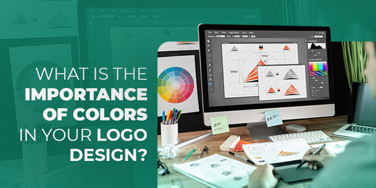
The first thing people notice in a brand's logo is its colour. Considering the psychology of colour, culture, personal preferences and context, an experienced designer or a graphic design company like Pentacodes can always create a unique logo for your brand.
In this blog, let's explore the significance of colours in logo design and how they can impact a brand's conquest.
Colour Psychology
Colour psychology says that colours can impact our emotions and behaviours. While not universal, the principles of colour psychology hold for most people, making it an essential consideration in logo design. Expert designers of Dubai graphic design companies will be well aware of the psychology of colours and will let you learn more about it too. Let us check some popular colours and emotions associated with them.
Red: Despite location, culture, or any other factor, red is a sign of excitement, danger, urgency and passion.
Green: As the colour of nature, green evokes relaxation and makes it feel organic, peaceful and healthy.
Blue: It brings a sense of trustworthiness, loyalty and professionalism. Blue even slows down the heart rate, resulting in calmness.
Yellow: Being a vibrant colour, yellow represents warmth, happiness and innovation. It can also provide an optimistic energy.
Black: It is considered as the symbol of power, boldness and elegance. It is also seen to induce a mysterious feeling.
These are only a few colours widely used in logos, and we can not exclude some, like purple, orange, grey, and pink, which all represent some unique emotions. By choosing the right colours for a logo, a graphic design company can establish a strong brand identity and create a lasting impression in the minds of consumers. As we have learned that colours trigger emotions, the logo designer should consider the kind of message they would like a particular colour to convey.
Do's and Don'ts of Selecting Colours
For a logo to be memorable, visually appealing and effective in communicating the brand's identity, designers of graphic design agency in Dubai should keep in mind some essential do's and don'ts. Let's have a look at some of them.
Do's:
Match the brand's personality and values: Choose colours that reflect the brand's personality and values. For instance, bright and bold colours can be used by a brand that wants to convey passion and excitement, while a brand that wants to communicate sophistication may go with muted or neutral tones.
Less is more: Visual clutter and confusion can be avoided by limiting the number of colours in a logo to two or three.
Experiment with different colour combinations: Colours, when combined with other colours, can have different effects. Test and refine with colours until the best combination is found. Only experts from top Dubai graphic design companies can do this effectively.
Study the cultural implications of colours: Cultural implications of colours should be considered as some colours have different meanings and associations in different cultures.
Don'ts:
Follow trends blindly: Choose colours that are eternal and reflect the brand's identity and values. Don't decide based solely on current trends or crazes. A reputed graphic design agency in Dubai will never do this to your brand.
Combine so many contrasting colours: Logos with too many high-contrast colours are difficult to read and may create visual tension.
Mix colours that clash: Designs with different colours that clash can be visually jarring and unappealing.
Incorporate colours that are too similar in hue or value: This will make the logo dull and uninteresting. Colours with contrasting hues can create depth and visual interest, making it more memorable.
Selecting suitable colours will help a brand stand out, convey a message well, and develop a lasting image in the viewers. Designers from a graphic design company may understand colour psychology and follow the do's and don'ts of selecting colours for their client’s logo, as discussed.
Our experienced team at Pentacodes will be the best option if you're in search of a graphic design agency in Dubai to assist you in creating the perfect logo that matches your brand's values. We are among the top Dubai graphic design companies that have an expert design team who can meet your distinctive needs. Reach us today to know more and take your next step in branding.


